Teach it Tuesday - Family Mashup.
Every Easter we take a family picture... I sketch up a few ideas and then run them by the boss. This year we came up with a couple of cool ideas, packed up the car and headed to the beach only to be met with tsunami force wind and rain. Our plan was nixed and I was pretty grumpy.
Instead of throwing in the towel I came home, drew up a couple of concepts that would work indoors. I set up the backdrop and the lights in the living room and told the family what we were doing.
The initial photo is pretty simple - I wanted a family photos that showed some character but also the "stuff" that surrounds these photo shoots. It is usually something that I go to great lengths to hide from you so this is kind of fun for me.
Once we took a few "safe" photos I then photographed each family member doing "funny" poses on the backdrop.
The concept was - what if the parents were little and the kids were big? My first attempt was to mix and match facial features but the outcome was REALLY creepy... like, Chucky doll creepy.
The next iteration version was the one pictured here... Ya the kids are big and the parents are small but it just lacks anything interesting...
I reached the final concept basically by it being the only remaining option... the feedback on this image has been mixed with some recoiling and others really enjoying it. If you are interested in how I edit photos like these please check out the video below where I show you everything from start to end in less than 3 minutes.
IIDA Cocktail Couture, 2014.
I don't remember exactly when I started working with the good folks over at IIDA but each year the bring me up to Jacksonville, Florida to photograph their amazing event. The Cocktail Couture is part fashion, part party and part fund raiser with proceeds going to Dignity U Wear, a charity that helps cloth children and families in need.
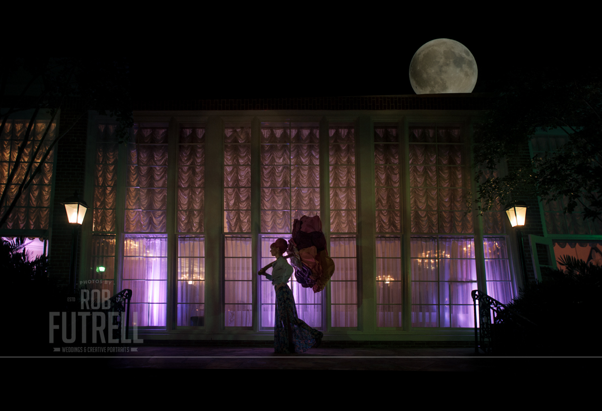
As the party was winding down last night we decided to have a little fun. This is an image of Becky sporting her giant mushroom umbrella... I am doing something kind of new today in not only showing you the final image... but if you look at the video bolow you can see how it was created. Enjoy!
Here is the making of video. Composited from 3 images in about an hour and half of work.
Teach it Tuesday - so you need a bigger camera | at the Treasury on the Plaza in St. Augustine
I can't tell you how often I find myself in situations where I wish I had a larger camera or at the very least, a bigger lens. One of the tricks that photographers have used for years to get more stuff into an image is a technique called 'the stitch'.
'The stitch' is not a blue alien from another universe... it is when you take an sequence of photos while slowly moving the camera from left to right (or up and down). Those raw photos are then loaded into Photoshop and the edges of each photo are blended into each other.
In March, my studio partner Kate Gardiner (whose amazing work you can see here) was asked by the owners at the Treasury on the Plaza to come down and grab a few photos on their inaugural night and being the solid gold friend that she is she called me up and asked if I thought I might be interested in joining her... I was like "let me reschedule my birthday party".
Inside the massive ballroom you could immediately see that even with my widest lens (a Nikon 16mm fisheye) that there is just too much room and too much awesome to fit into a single frame. Instead of trying to photograph the room with the fish and deal with that distortion I instead opted to perform a free hand panoramic stitch.
Gear used:
+ Nikon D800
+ Nikon 24mm f/1.4
+ 2 x Lumipro LP180s
+ 2 x Pocket Wizard Plus IIs
Here is the initial sequence of 12 images as well as the final image.
A total of 17 images were needed for the final image (12 for the stitch and another 5 reference photos). In order to get to the final image a few more adjustments had to be made.
Here is the photo that is mid-processing... as you can see there are still a lot of issues from the original stitch that need to be corrected. The room is too dark, the color needs to be adjusted, the columns needed to be rebuilt and Drea (from Coastal Celebrations) needs to be removed.
I am showing you the behind the scenes to remind you that this technique won't solve all of your problems... but with a normal camera, a somewhat wide angle lens and a little bit of patience the final image is at least 12 times more awesome :)
p.s. you have to check out the ballroom over at the Treasury on the Plaza... they turned the old safe into a bar!

